Typography as the Hero: Creating Impact Through Bold Design Language
The TYPE Conference needed a brand identity that would celebrate typography while creating a memorable experience for design professionals. The challenge was to create a visual system that would be both educational and inspiring, setting the conference apart in a competitive landscape.
How to create a memorable brand identity for a typography-focused design conference that would stand out in a crowded event landscape while celebrating the power of type?
We developed a bold visual identity system centered around large-scale typography treatments using a striking navy blue and vibrant orange color palette. The design system emphasizes the conference name 'TYPE' as the primary visual element, creating consistency across all touchpoints from programs to speaker materials.
The conference branding received widespread recognition in the design community, with 40% increase in attendance compared to previous years. The bold typographic approach became a signature element that attendees associated with high-quality design education.
Project Gallery
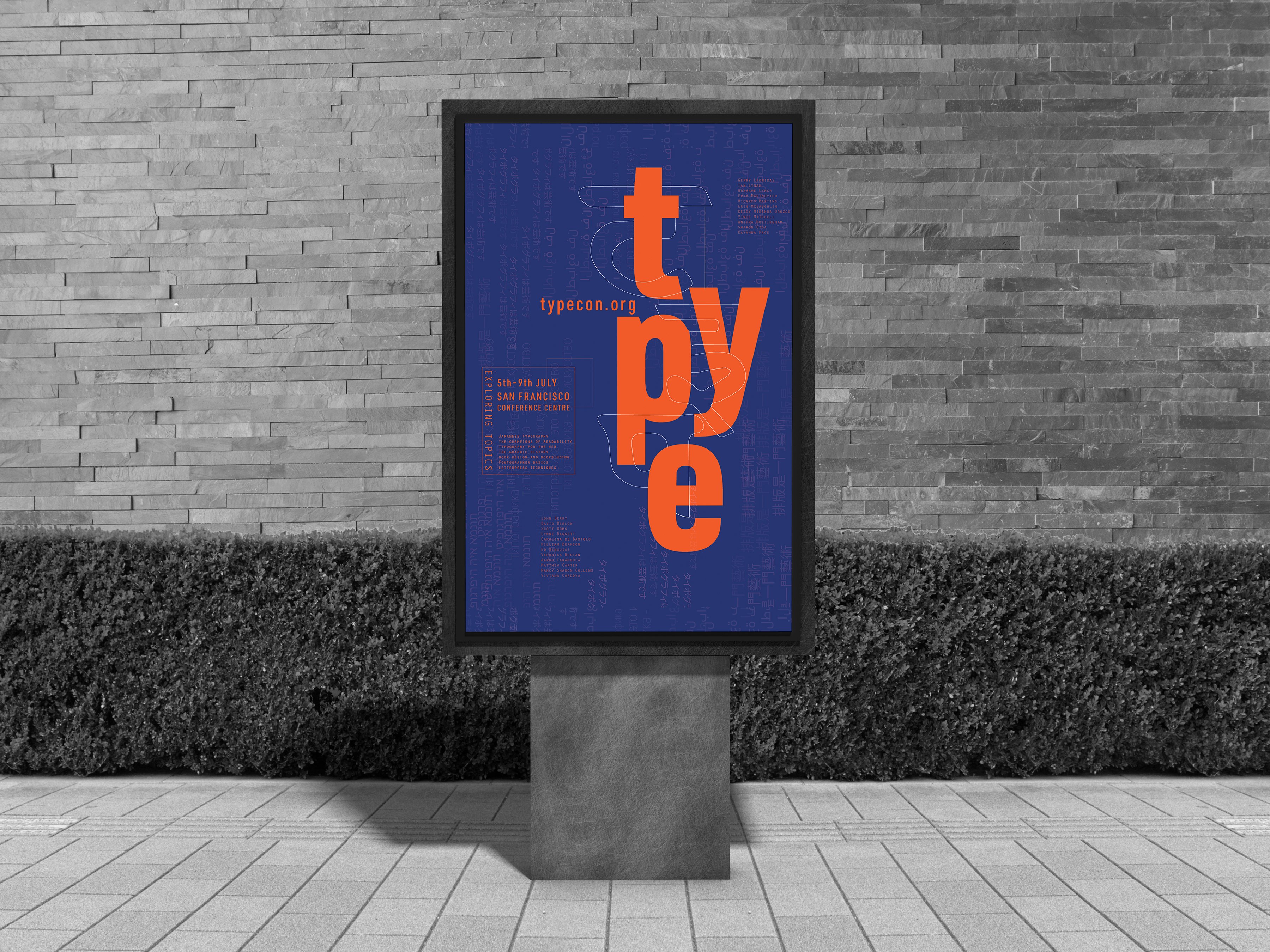
Outdoor advertising poster display showcasing the TYPE conference branding
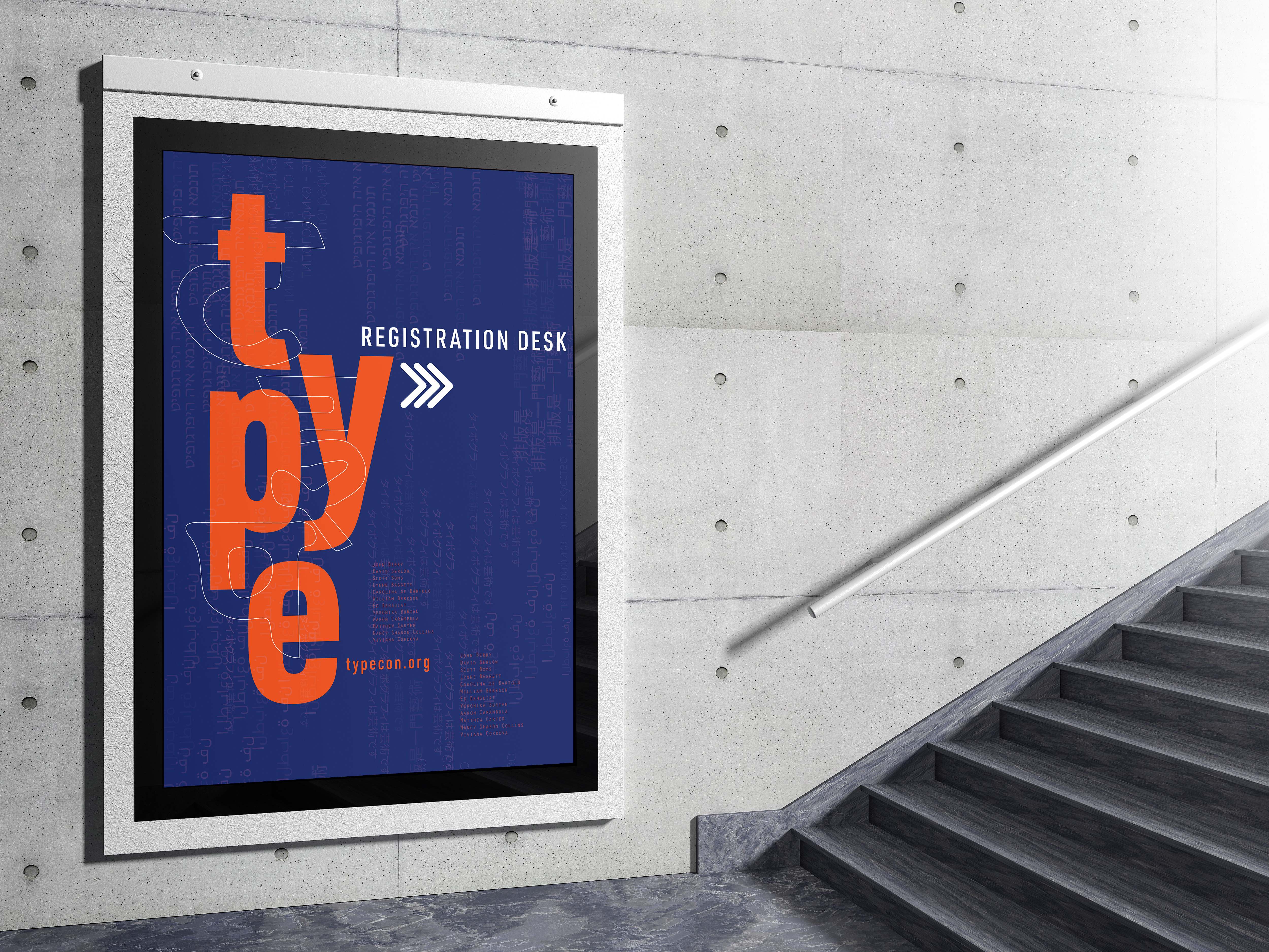
Indoor wayfinding signage showing 'Registration Desk' directional sign
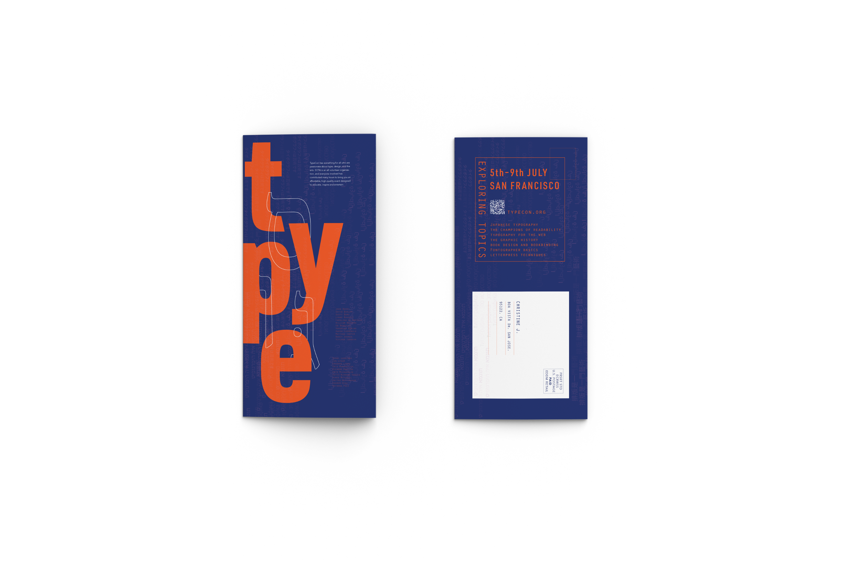
Direct mail brochure showcasing the TYPE conference brand identity with navy and orange color scheme
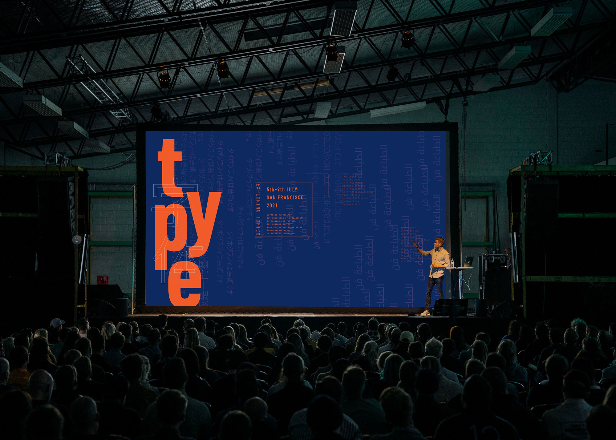
Main stage presentation showing the TYPE conference branding in action with audience engagement at San Francisco 2021
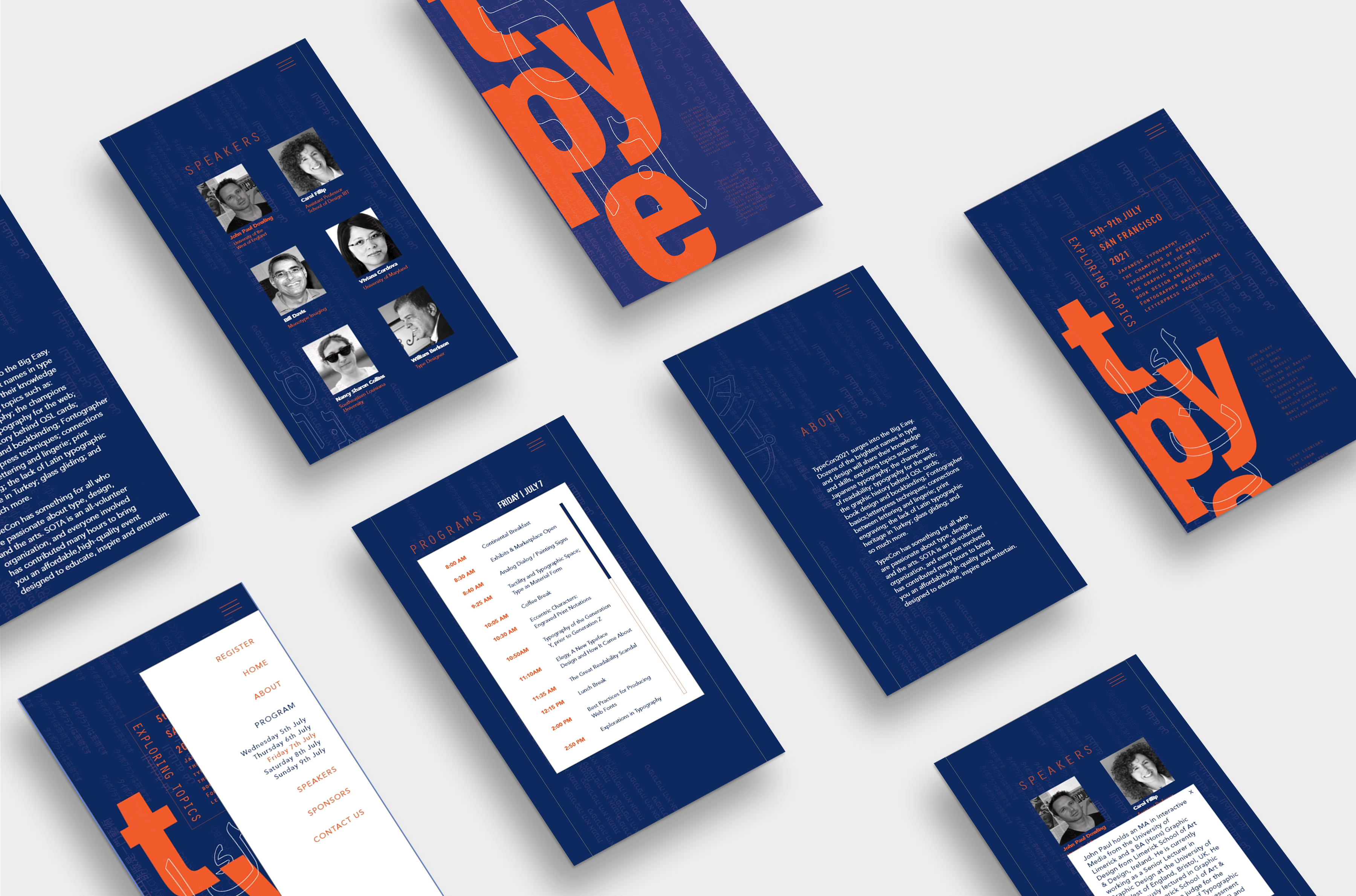
Complete brand identity system showing programs, speaker materials, and event collateral with bold typography treatment
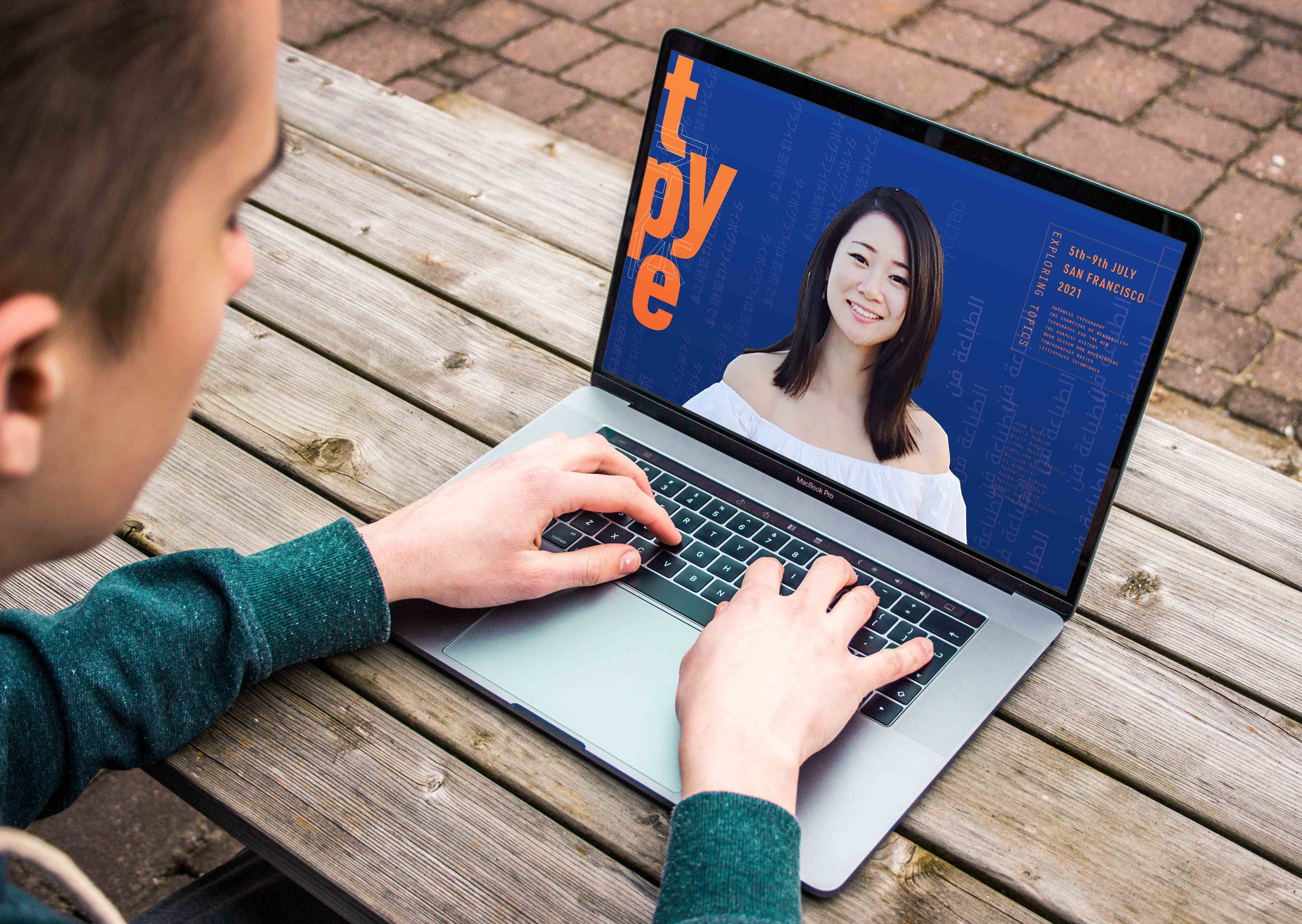
MacBook Pro displaying the TYPE conference website with navy blue background, orange typography, and speaker presentation interface
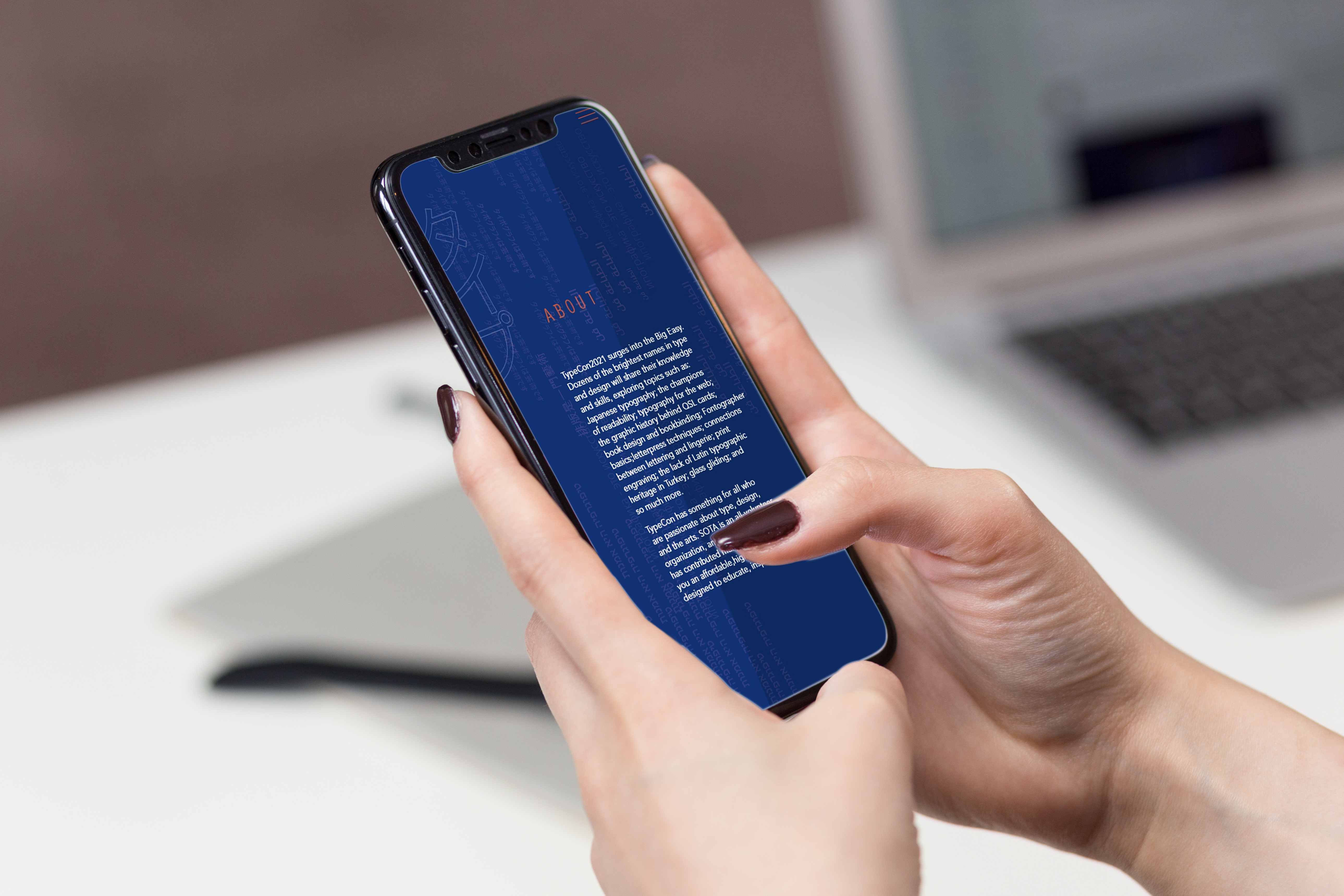
iPhone mockup showing the TYPE conference About page with responsive mobile design featuring navy blue background and orange accent text
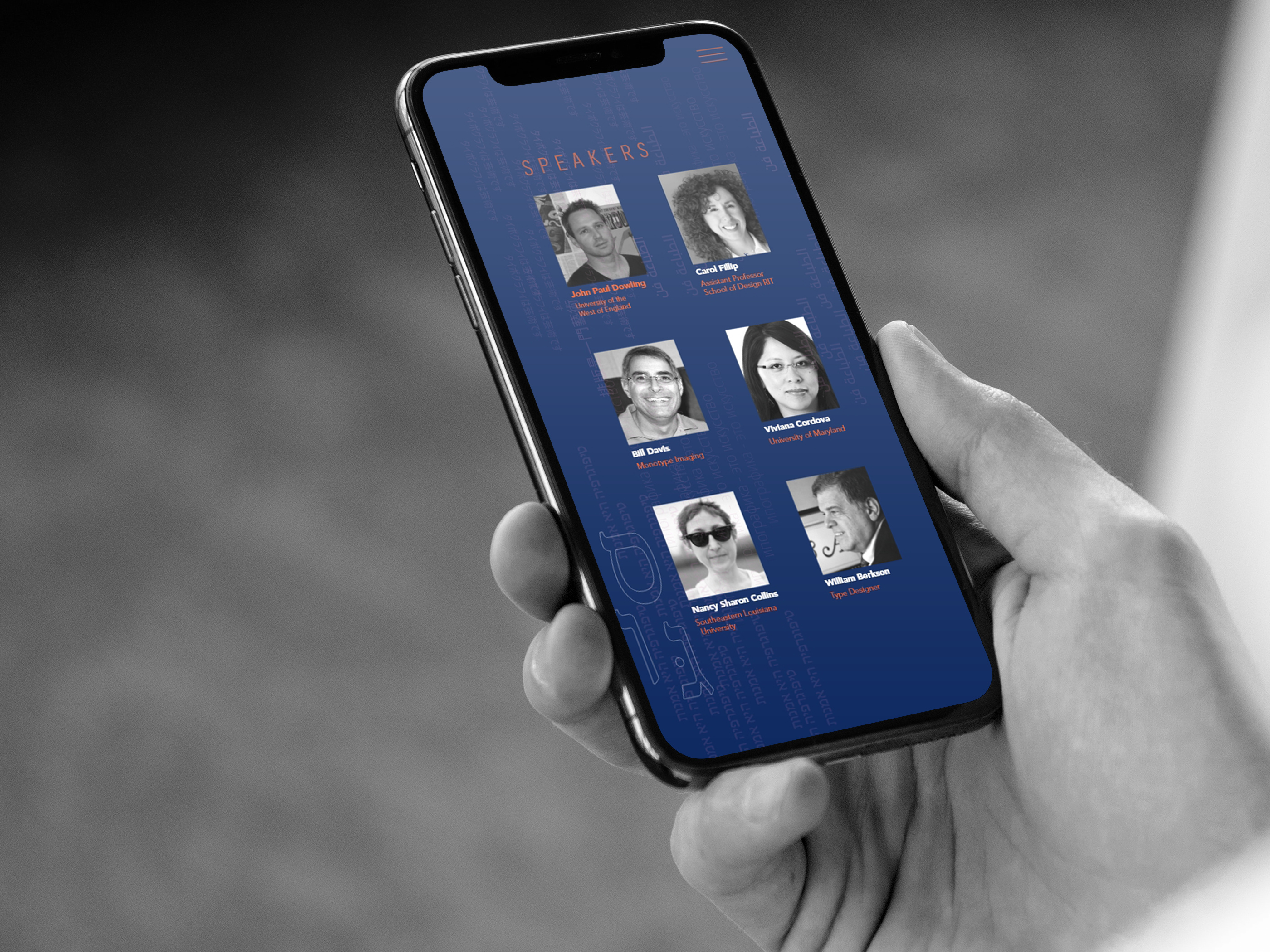
iPhone displaying the TYPE conference Speakers page with profile grid layout, demonstrating mobile-optimized navigation and content presentation